Text Input Layouts
9 Apr 2016I’m not going to go into all of the intricacies of the TextInputLayout API in this post, but rather describe some of the nuances to keep in mind while building Text Input Layouts into your Android application. If you’re just getting started on using this API, there’s good documentation here and here and here. After creating a few applications that contain Text Input Layouts myself, I’ve picked up on a few issues with the API and I thought I’d share those here.

When do I use a TextInputLayout?
I’m personally only using Text Input Layouts when I need to display an input form within a fragment. For instance, if you’re building a screen for allowing users to create new payment accounts with a credit card, Text Input Layouts are great for displaying helpful error feedback in a friendly and responsive way.
I’ve honestly never used the character count functionality that’s built into the layout because I feel that it detracts from the cleanliness of the EditText view. In my opinion, users shouldn’t ever care about the number of characters they’re entering unless there are hard requirements around the number of characters that they’re allowed to enter. And even then, if the user will hardly ever hit that requirement, then you should just use the input layout error functionality and not the character count.
So, what should you consider when using this API?
1. Clearing and Setting Errors
What I’ve learned from the error functionality of TextInputLayouts is that you should never make back-to-back calls to the setError() layout method for the same TextInputLayout.
For instance, don’t do this:
firstInputLayout.setError(null);
firstInputLayout.setError("This field is required");
The error that’s displayed will be the first error, which is an empty error in this case, instead of the last error that was set (i.e., “This field is required”). The reason for this happening is because the animation on the first setError() call hasn’t finished before the animation of the second call.
So, the error is actually set to “This field is required” after this, but what’s displayed is a blank error message:

This may be obvious after looking at the code as I’ve written it above, but when your error validation code consists of several different checks for several EditTexts (and you happen to think you should clear the errors before setting them again, like I did), it’s not as easy to track down what may be causing the issue.
You can test this out with the gist I created here: TextInputLayout Issues with setError
2. EditText colors set to black on error being cleared
Watch out for the known issue of the EditText coloring getting set to black once the error is cleared. Black isn’t actually the default color of TextInputLayouts or the color of EditTexts (it’s a darker grey). So, when it’s set to black, it calls the user’s attention to something that is in a normal state, which shouldn’t happen. It detracts from the usability of the form input. You can read up about this issue here: Issue #203357. Good news is that as long as you update to revision 23.3.0 of the Support Library, which was just released as of this month (April 2016), then you won’t have to worry about this one.
3. Styling TextInputLayouts
Accent Color and Error Color
You can style your TextInputLayouts with an accent color and even set the color that the layout will display when it is in an error state.
The accent color only affects the EditText that is currently in focus. The rest of your TextInputLayouts will fall back to the standard primary text color when their EditTexts are unfocused.
To do this, go to your styles.xml file and set the colorAccent for your app’s theme:
<style name="AppTheme" parent="Theme.AppCompat.Light.DarkActionBar">
    <item name="colorPrimary">@color/colorPrimary</item>
    <item name="colorPrimaryDark">@color/colorPrimaryDark</item>
    <item name="colorAccent">@color/colorAccent</item>
</style>
Also, create a new style for your TextInputLayout error text color:
<style name="MyTextInputLayoutErrorText" parent="TextAppearance.Design.Error">
	<item name="android:textColor">@color/customErrorColor</item>
</style>
And set the errorTextAppearance attribute on your TextInputLayouts:
<android.support.design.widget.TextInputLayout
    android:id="@+id/first_input_layout"
    android:layout_width="match_parent"
    android:layout_height="wrap_content"
    android:hint="@string/text_input_one_hint"
    app:errorEnabled="true"
    app:errorTextAppearance="@style/MyTextInputLayoutErrorText">
    <android.support.design.widget.TextInputEditText
        android:id="@+id/first_edit_text"
        android:layout_width="match_parent"
        android:layout_height="wrap_content"
        android:singleLine="true"
        android:imeOptions="actionNext"
        android:nextFocusDown="@+id/second_edit_text"/>
</android.support.design.widget.TextInputLayout>
Beware of extra padding!
Don’t stack your TextInputLayouts too close together, because the error of your first TextInputLayout might overlap the hint of your second input layout. Generally, you only need to worry about this if you’re manipulating margins or padding for your vertically-oriented layout of TextInputLayouts. But, it’s something to always keep in mind since hints float above the EditText only when the EditText is focused (i.e., the cursor is on your EditText).
Adding two TextInputLayouts side by side
In order to accomplish this, you should use a LinearLayout to wrap the two TextInputLayouts with a horizontal orientation, because you don’t have to do anything extra to align the TextInputLayouts. Make sure to set the same weight on each of your TextInputLayouts! This way, your layouts don’t look unevenly aligned and you won’t give anyone a heart attack because of their incessant desire to have everything in their life perfectly aligned (like myself).
<LinearLayout
    android:id="@+id/input_fields"
    android:layout_width="match_parent"
    android:layout_height="wrap_content"
    android:orientation="horizontal"
    android:baselineAligned="false">
    <android.support.design.widget.TextInputLayout
        android:id="@+id/first_input_layout"
        android:layout_width="0dp"
        android:layout_height="wrap_content"
        android:layout_weight="1"
        android:hint="@string/text_input_one_hint"
        app:errorEnabled="true"
        app:errorTextAppearance="@style/MyTextInputLayoutErrorText">
        <android.support.design.widget.TextInputEditText
            android:id="@+id/first_edit_text"
            android:layout_width="match_parent"
            android:layout_height="wrap_content"
            android:singleLine="true"
            android:imeOptions="actionNext"
            android:nextFocusRight="@+id/second_edit_text"/>
    </android.support.design.widget.TextInputLayout>

    <android.support.design.widget.TextInputLayout
        android:id="@+id/second_input_layout"
        android:layout_width="0dp"
        android:layout_height="wrap_content"
        android:layout_weight="1"
        android:hint="@string/text_input_two_hint"
        app:errorEnabled="true" >
        <android.support.design.widget.TextInputEditText
            android:id="@+id/second_edit_text"
            android:layout_width="match_parent"
            android:layout_height="wrap_content"
            android:singleLine="true"
            android:imeOptions="actionDone"/>
    </android.support.design.widget.TextInputLayout>
</LinearLayout>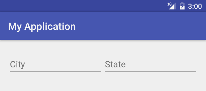
4. New (undocumented) TextInputEditText API for Extract Mode
Uhhhh… What the heck is a TextInputEditText?
Don’t worry! If you’re not familiar with the TextInputEditText API, you’re not in trouble. Don’t feel like you need to go change all of your EditTexts to TextInputEditTexts now, because the TextInputEditText is nothing more than an EditText with an extra fix for a minor Input Method Editor (IME) usability feature: Extract mode.
Uhhhh… What the heck is Extract mode?
Extract mode is the mode that the keyboard editor switches to when you click on an EditText while you’re in landscape mode on a smaller device. The screen switches to a “full screen” editor view, like so:

As you can see, the IME is extracting the text view into a full screen view once the user clicks on the TextInputEditText. To get back to the original point, TextInputEditText simply provides hint text while the user’s device’s IME is in Extract mode. If you’re using an EditText instead of a TextInputEditText, the user will not see the “City” hint text that I’ve shown in the gif above.
Ok, so why didn’t Google’s Android team just add this API into the EditText API? In the javadoc for the TextInputEditText, it describes itself as:
A special sub-class of EditText designed for use as a child of TextInputLayout
If you use the TextInputEditText in any other layout, the EditText won’t have any reference to a TextInputLayout hint, so there’s no way for the IME to know what text to display as a hint in Extract mode.
Also, keep in mind that if you’re not using TextInputLayouts, there’s no point in using the TextInputEditText API.